Research shows when we see certain colors,
our brains release feel-good chemicals that impact us on a physical and emotional level. A study published in the October 2019 issue of Journal of Environmental Psychology indicates YELLOW is usually the color of happy, joyful
emotions.
Happiness improves our sense of well-being. However, the study also revealed not all people associate yellow with good vibes.
Those who live close to the equator and in climates with a scarcity of rain, find yellow less attractive than people who live in cooler, rainier climes.
To illustrate, look at the color wheel below. It is a visual representation of the broad range of hues in the visible light spectrum.
RED, ORANGE, and YELLOW are three colors that appear next to each other on the color wheel. For additional details about the origin of the color wheel and its creator, Sir Isaac Newton, look here.
RED, ORANGE, and YELLOW are three colors that appear next to each other on the color wheel. For additional details about the origin of the color wheel and its creator, Sir Isaac Newton, look here.
Warm colors often evoke feelings of
happiness, optimism, and energy. Warm hues make rooms and objects appear smaller, because they make them look closer and create a cozy feel.
Warm hued paint colors, carpeting, or furniture makes spaces look more
intimate. A word of caution. A big concentration of warm color can be overwhelming, and may even stimulate aggressive emotions. To offset this, pair warm tones with neutral ones.
ORANGE is a bright warm-toned color. It's the color of many healthful, tasty fruits and vegetable.
Orange energy supplies a dose of emotional support. Its power helps us feel creative, enthusiastic, and perky.
RED is an energizing warm-hued color. It speeds up metabolism and inspires excitement, passion, and love. Red reminds us of heart health. For heart disease prevention tips see this.
PINK is next to red on the warm hued area of the color wheel. It evokes feelings of gratitude and admiration. The color pink carries with it the meaning of elegance and
grace. It reminds us of sweetness and tender loving care.
Dark pink is the variation of pink that is often used as a symbol of
gratitude and appreciation, and is a color I love to wear.
Another factor that influences our color preferences is unique to each individual. Colors work at the cellular level and bypass thinking. Color likes and dislikes are subjective, and often are affected by our life experiences, mindset, and feelings.
When we interact with someone (a loved one or even stranger) or participate in something that is meaningful to us, we are likely to remember and associate it with the colors we saw.
Colors can make our surroundings, peoples' body language, and sounds, smells, textures, and moments vivid, and our memory of them long lasting.
A quote that appears on the U.S. National Library of Medicine, National Institute of Health (NIH) Website follows.
A quote that appears on the U.S. National Library of Medicine, National Institute of Health (NIH) Website follows.
"Colour is believed to be the most important visual experience to human beings (2). It functions as a powerful information channel to the human cognitive system and has been found to play a significant role in enhancing memory performance (3)."
How many of the warm hued colors mentioned above bring you pleasure?
When I wear bright pink I feel optimistic and lovable. Red reminds me of romance and I associate it with the sweet aroma of fresh roses just picked from my garden. Orange lifts my spirit as I envision a gorgeous southwestern sunrise or sunset. Yellow makes me think of fun times and sunflowers and popcorn.
Cool colors are often more subdued than warm ones. Cool colors recede and appear to be farther away from the observer than warm ones. Cool
colors include green, blue, and purple, and variations of those three colors.
BLUE is a favorite color for a large segment of the world population, and is slightly more popular
with men than women. Blue is the only primary color within the cool spectrum.
Blue is a great stress buster, and letting go of tension helps us feel happier.
GREEN is a cool-hued color that helps us establish a pathway for renewal,
expansion, and flexibility. It promotes growth, balance, good
health, and abundance.
For colorful ideas about ways to enhance your lifestyle with green see this. Some shades of green take on elements of yellow, and uplift our spirit.
PURPLE possesses some of the attributes of red, so it's a less subdued cool color than the others.
Wear a light shade of purple (lavender) to calm hyperactivity.
Connect with Crown Chakra Energy and its corresponding color of purple to Integrate Mind, Body, and Spirit and feel centered and peaceful.
Warm and cool toned colors can help us feel greater happiness. Let's cultivate those that appeal to us.
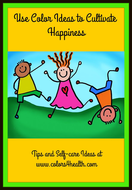
There are so many ways to use colors to attract goodness into our lives. Decorate, don, and envision colors. To spice up our day, let's visualize happy kids in colorful hues dancing (see first illustration above).
Cultivate colors to feel content, nurtured, and increase happiness!
Before you go, don't forget to comment below.
Which colors help you feel happy? Please explain.
If you like what you see, please share the love on social media. When you do, please put a link back to this post.
This post has been shared at Thursday-favorite things party
This post is featured at abundance-and-gratitude-at-the-hearth-and-soul-link-party
This post is FEATURED at #TFT Yahoo. Thrilled and Delighted!
This post has been shared at Skimmer-shorts-and-tees-for-spring-fashion-over-60-link-up
This post has been shared at unlimited-monthly-link-party-17
This post has been shared at nurture-yourself-at-the-hearth-and-soul-link-party
This post has been shared at #TFT It's #56


